Experiments
Every now and then, an article or an interesting discussion brings up an idea that could improve the way we use our computers. Whenever I find the time to try out one of those ideas, and the results are interesting, the demos and descriptions can be found here.
Bringing The Humane Interface to OpenOffice.org
June 2009
In late 2008, OpenOffice.org announced the project “Renaissance” with the stated goal of giving the office suite's user interface a complete overhaul. To collect some ideas, there has been a public call for proposals, which I couldn't resist. You can read my proposal “Habituating Interaction” at the OpenOffice.org wiki.
Claim Back Your Browser
December 2008
Bookmarklets, or favelets, are old news. But even today, many people never heard of them, and the power and versatility of bookmarklets is frequently underestimated. They are a convenient way to let you, the user, do anything you like with the contents of your browser, without having to download extensions or plugins. Text arranged in an illegible manner? Side column full of distracting animations? Simply change it. Want to use some info on the page in some other web service (like google mail)? Just click "send as google mail". It's your browser, so you should be in control. There's no need to use a particular browser or install browser extensions. Bookmarklets work in your favourite browser, and are a non-proprietary way to handle these tasks perfectly.
From a technical perspective, bookmarklets are little snippets of JavaScript, neatly packaged into an URI starting with "javascript:...", that can be stored in the bookmarks bar of your browser (e.g. by drag and drop). Clicking the bookmarklet executes the JavaScript code in the current Web page.
This makes it possible to re-gain control over what's going on in your browser window. Want to remove that irritating ad? Just go ahead and delete it. Want to make that column wider or narrower? Simply resize it. And so on and so on.
Here are a few example bookmarklets. Drag them to your bookmarks bar to use them. If you're using Safari, you can also access them through a CMD-<Number> shortcut, where <Number> corresponds to their position on the bookmarks bar.
- Delete lets you remove elements in the page (paragraphs, columns, pictures, ...) by clicking on them. Just don't click directly at flash elements, as they're tricky beasts and will notice the click anyway. To remove flash blocks, you need to remove their surrounding block. You'll usually find one by moving your mouse around a little around their borders.
- Resize allows you to widen or narrow any block on the page. Useful for pages that seem to be made for screens with a width of 10000 pixels, as well as for those that have mile-long text columns with only 2 words per line.
- Map opens Google map with the currently selected address (in a new window; it lets you edit the address before submitting the query, because I found that you often deal with partial addresses).
- Images lists Google Images results found with the selected text (in a new window; it asks you for search terms if nothing has been selected).
- Google Preview shows off what bookmarklets can do. Click this bookmarklet on a google search results page to get mouse-over previews for the search results.
- Back and Forward decrement or increment the last number in the URL. Useful for flipping pages on some sites (not only on icanhascheezburger).
- Open Link opens the currently selected link. This is particularly useful in Safari: Search for a link text, like "download", and you'll notice that the current search occurrence is selected. When you invoke the bookmarklet, the highlighted link will be followed. Example: CMD-F, "downl", CMD-1.
OpenOffice.org: Function Assistance in Cells
March 2008
Here's another series of live mockups to support a discussion in the OpenOffice.org User Experience discussion group which dealt with the question of how to best provide assistance when entering formulae into spreadsheet cells. The mockups do not necessarily represent my idea of how to approach the problem, but were meant to support the discussion in making the suggested behaviors tangible and easier to evaluate.
Enso: To make simple things simple...
...and complex things possible.
February 2008
Humanized recently proposed a new design for their launcher Enso. Below, I'll discuss its advantages and drawbacks, and suggest a new sub-application, called Scratchpad, that would solve the problems of the current approach. If you're the visible type, you can start by watching a quick tour (part one, part two) or try out the Enso Interface Demo yourself.
The idea of an Enso scratchpad was first brought up by Braydon Fuller in a discussion at humanized.com.
About Enso
This is about Humanized's great application launcher called Enso. An application launcher is a piece of software that you invoke with a shortcut and use to start an application by typing (part of) an application name. This can be much faster than using a Start Menu or browsing the Applications folder. Many launchers also let you perform other actions related to typing, e.g. looking up a word in a dictionary, or performing a web search.
Most launchers are modal: That means that typing the same letters may lead to different outcomes, depending on the state your system is in. If you're uncertain what mode you're in, errors can occur. Mode errors can happen very easily if you become distracted, if the user interface is sluggish, or if you have bad eyesight. Most launchers are a mode: You have to pay attention to the computer's state to be certain that you're in launcher mode. If you always watch closely and pay attention to where the entry focus is, you will correctly predict where the letters will appear. But, in addition to being a possible cause for errors, this drains attention from your current task, and you're more likely to forget what you've wanted to do. Enso has the solution: the Quasimode. Enso is only active as long as you hold down the Enso key. When you release the key, you're back to where you've been. No invoke-dismiss distinction here. No modes.
Enso is not just another launcher—it's a new approach to launchers. First, it doesn't primarily launch applications, but execute commands. Examples are open notepad, or calculate. Second, commands like calculate, or translate to french take your current selection in your current application as their input and replace it by the result. That way, those commands are available in every application—with one single interface. Take a look at the Enso Demo Movie and the Enso Tour.
Humanized's Proposed Design
Now, I'm not writing all of this just to tell you how great Enso is. It's because I'm not satisfied with Humanized's plans about future versions of Enso. The Humanized team explained their plans and motivation in this weblog article. They addressed the following frequent complaints about Enso with the following proposed solutions:
| Problem | Proposed solution |
|---|---|
| Enso shouldn’t make you type all of “open” every time. | A smarter, non-contiguous autocomplete algorithm that learns the shortcuts you use. |
| Enso should be able to open paths and urls. | [The article doesn't state in what way that has been addressed.] |
|
Enso should support international character input. [This problem stems from the fact that, for some commands like google, there has been no clear separation between commands and their arguments: You type their text argument directly when in command mode (e.g. google états-unis).] |
Separation between commands and their arguments.
Embedding text-fields for arguments in the Command structure (like email [message] to [recipient]). |
| Enso should gracefully handle the case where there’s no convenient place to enter text. |
Same form for every command (no google and google search terms variants any more).
Every command with arguments now has one or more text fields after its command name (e.g. google [search terms]). If there's a text-selection, it becomes the default value in the argument field. If there's no selection (and also if there is), you can enter your text argument right into the text field. Press Return to move to the next text field or execute the command. |
| Enso shouldn’t require you to type out text, select it, and then run a command when you’d rather run the command and then enter the text (think calculate). | Every command now has a structure of "command first, argument second" (verb-noun), where nouns may be pre-filled with a previously made selection. |
|
Enso shouldn’t make you hold down a key while typing lots of characters. [Again, this stems from the problem that typing long arguments in command mode can be uncomfortable, e.g. google the humane interface jef raskin amazon.] |
Again, separation between commands and arguments and dedicated text entry areas. |
What's good about the proposed solutions:
- Clearly separating commands from their free-text arguments (But I still believe that application names and window titles are part of the open and go commands).
- Making all Enso commands conform to the same order (they chose verb-noun).
- Better autocomplete and learning algorithm (think Quicksilver).
What's not so good:
- Due to verb-noun order, every command now has to be confirmed by hitting the Return key. The Return key is necessary to complete your argument (noun) entry if there is one. But for the interface to behave consistently across commands, you have to do this for every command, even for commands that don't have any arguments.
- Enso's advantage of being quasimodal, thus useable without looking, is diminished by the fact that now, when you push down the Enso key, type calculate and let go of the Enso key, you're in a different mode from that you were in before you started. You're still in Enso. Until, that is, you leave it with the Return (or Esc) key. Another verb-noun casualty.
- Splitting the open X commands into two parts. This may sound like I'm contradicting my praise of the command-argument separation from earlier, but please bear with me. Open notepad must be one single command to be quick and fluent, not a two-step process. Launching an application is very different from typing an email, and shouldn't be treated like some kind of argument, but part of the command name itself. The same applies for translate to french, translate to japanese, etc. where there have been discussions of splitting the command up into the translate part and its language. So why do I think that there's a difference? Doesn't this introduce inconsistencies with the "other" arguments? It doesn't, because the app to launch and the language to translate to are not arguments in the sense of free-form text. They are a variation of the command behavior. When the user has to choose the language/app from a closed set of options, that will be the Enso equivalent of introducing special command line options in addition to ordinary input arguments. That's uncomfortably reminiscient to those über-versatile commands of the command line interface (tar, anyone?). So, lets stick to single-purpose commands. One for each command variant. They don't introduce another concept (free-form vs. closed-set arguments) and are quicker to invoke.
Verb-Noun vs. Modelessness
I understand the motivation behind making the command-argument order consistently verb-noun. First of all, I also think that all commands should commit themselves to one order. So far, that's great. But it's the wrong order. As I understand it, many people felt that first stating what to do and then stating what to do it with felt more fluent and natural to them (like calculate 3+28 instead of 3+28 calculate). And I believe they really feel like that. But I don't believe that this order is more natural, i.e. more humane. I am convinced that this is a case of a learned preference. In his book, The Humane Interface, Jef Raskin goes to great lengths to describe that we often prefer interfaces we are used to, but that this doesn't make those interfaces any more humane.
"But if the verb-noun order isn't any better, why is it used everywhere?" The answers are: Technology and culture:
- Command line interfaces traditionally start with verbs. Back when they've been invented, it was easier to implement, because it just matches the first token in the command string against executable files in the search path. It also was an analogy to imperative sentences in English.
- The imperative mode (no pun intended) in English has a verb-noun structure, like "send <file>". But this doesn't mean that "our brains are wired that way". In German it's common to use a noun-verb construction, e.g. "<Datei> abschicken". So the verb-noun order doesn't have its origin in human cognition, but in culture.
- In forms (those we fill out), for each question we first have the label, stating a class, and after it we fill in our class instance (e.g. Andreas is an instance of the class First Name). This order comes from the fact that questions usually precede their answer. The aim is to guide the person who fills in the form. After all, no one would know what is being asked when just presented with an empty text field. Although this comparison may seem far-fetched, a command is also a kind of question (calculate what?), and the argument is the answer (4+28). Using forms to structure information gathering processes has become a ubiquitous design pattern in user interfaces. Just look at all those dialogs and text entry fields. This form pattern is so powerful that it influences many user interface decisions—even if there are more suited approaches available for the task at hand. I'll get back to Enso's relationship to forms in the next section. I believe there has been a mix-up between the concepts of commands and forms/wizards in the proposed Enso 2.0 interface.
So in what way would things be any better with a strict noun-verb order? If you've seen the Enso Demo Movie, you'll have noticed the simplicity and elegance of having the command do its task as soon as you've typed it. For commands with one or no arguments, Enso would keep this simplicity, and it could keep its quasimodal nature.
A big advantage of noun-verb ordering becomes apparent when we consider distractions. Here's an everyday work situation: I've just started to calculate something or to google for something, when the phone rings, or my cow-orker turns around and asks me something about lunch. And I've forgotten what I just wanted to look up. Now, the most valuable payload of actions like these is not that we want to calculate something, or search the web. We can remember that all right. It's the numbers and search terms that we easily forget when we get distracted. When we type them first and get distracted then, they are still sitting there when we come back, waiting for us to pick up where we left. But when we type the command first, this introduces an (admittedly small) gap where we have to keep our valuable numbers in short-term memory, and if distraction strikes right at that moment, we forget them. Everyone who has children and works from home knows what I'm talking about.
But what if my current application doesn't let me type text to select? Well, just provide an application that I can type text into. In my proposal below, there's a new command called open scratchpad that opens an empty text entry area. So, when I want to calculate a sum, I open scratchpad, type 3+28, and issue the calculate command. That's all. No need for an extra keystoke for all commands. And the scratchpad closes automatically when you're leaving quasimode, so you can continue working right away.
But what about two-argument commands, like email <something> to <someone>? That's easy, too. The Scratchpad keeps a history of your previously entered texts, so you can stack arguments on top of each other: Just open scratchpad, type the email address, open scratchpad again and type your message. Issue the email command and you're done.
Of course, you can also add your current selection to the scratchpad. Use the add to scratchpad command.
You can try this out in the Enso Interface Demo right here, right now, in your web browser. Or sit back and watch the quick tour (part one, part two).
Commands aren't Forms
Commands are short. Users can build a habit to use them without thinking about them. They can become a single gesture. Forms, on the other hand, gather information from the users and guide them through the process.
So, what is Enso's purpose? What tasks should it make easy? Should it aim at complex actions, making it comfortable to fill in multiple arguments comfortably? Or should it aim at making it easy to carry out simple, straightforward commands with few or no arguments? You can't optimize for both.
To my dismay, the makers of Enso have chosen to optimize for complex actions, at the cost of making it more cumbersome to carry out simple commands. In the proposed behavior, every command is a form, and the Return key submits the form. Even those commands that are so simple that they don't have any fields to fill in.
But it's the tiny, simple commands where Enso shines. Once you need to distinguish between 2-3 arguments, the process becomes so complex that Enso loses its "do without thinking" edge anyway.
That's why Enso should focus on the noun-verb, simple style commands. I'm not saying that Enso shouldn't support forms at all. But we need to make the distinction: Be honest and call them forms or wizards, not commands. They're more like little single-purpose applications than commands.
If you treat those forms like applications, you could invoke them, for instance, by using a command like open email form (suggesting their application-like nature). Their appearance should make clear that they're not commands, but more like windows. You could tab through them and submit them by pressing Shift-Return (Return inserts a line break into text fields). If you treat them as applications, you get additional bonuses: For example, you would be able to use Enso to calculate a sum while filling out an email form.
I want to make another thing clear: Simple commands don't mean that we are limited to off-the-shelf widget/gadget-like commands that just display time zones or calculate your BMI. With the right command set, Enso becomes really powerful. And even more so by allowing for chaining commands (See the Scratchpad specification below for details). As an example: append the current selection to a text file, compress the text file, send it to a recipient—all possible by chaining simple commands.
Scratchpad Specification
The scratchpad is an Enso sub-application. It will mainly be used by the user to enter text for the next Enso command when they're not currently in a text-editing application. The scratchpad keeps a history of previously entered texts and used selections: history items (also called text items below).
The scratchpad is invoked by the open scratchpad command. This command name has a space character at its beginning, to allow for the use of space as an abbreviation.
When the scratchpad comes up, it presents itself as a large rectangle in the middle of the screen, reminiscent of an application window. It has a text entry area, which has entry focus. On bringing up the scratchpad, an empty text item is created and shown in the text area. From the text area, a row of four boxes stretches upwards. These contain the four most recent history items of the scratchpad. The history boxes gradually appear more translucent and less tall on their way up.
The user can enter text or/and use the OS's copy/paste functions to fill in the text.
The user can use the Page-Up/Down keys to move up in history and back again. Thereby, the user can move older items into the text entry focus and edit them. When the user moves up in the history, the item following the one that's currently in the text entry area is shown in a history-like box right beneath the text area.
When the user pushes down the Enso key, the scratchpad is made partially translucent, but stays visible and must still be readable. The text entry area loses input focus. The contents of the scratchpad are updated as follows:
- If the initially empty (downmost) item is still empty, it is removed.
- The text item that currently has text entry focus is moved to the most recent (downmost) history position (It gets "bumped").
- The scratchpad shows the most recent (downmost) item in the text entry area.
The Enso quasimode behaves just the way it normally does, with the addition of highlighting the to-be-used arguments in the scratchpad (see below).
When the user has pushed down the Enso key and releases it without entering a command, or after entering a bunch of characters that don't match any command, the scratchpad fades out and no command is executed.
When the user holds down the Enso key and starts typing a command name, the number of arguments of the currently selected command comes into play (we're still holding down the Enso key). Depending on the number of arguments that the current command needs, the same number of history items is highlighted in bright color, always starting with the most recent (downmost) item. This highlighting changes in real-time to fit the command as the user continues typing, uses backspace, or uses the arrow keys to select a command from the suggestion list.
When the user has selected an existing command and releases the Enso key, the scratchpad fades out and the command is carried out. If the command has a result, it will be added as the most recent scratchpad item. A transparent message will notify the user of the result and where they can find it.
If a command cannot be carried out, for example if the number of text items in the scratchpad history is less than the number of arguments of the command, or if the command cannot deal with the format of some arguments, the command must display a corresponding transparent message, but the scratchpad fades out anyway.
If the user issues a command on a normal application selection, i.e. without an open scratchpad, that selection is added to the scratchpad history. This provides a safety net for destructive commands like calculate when there's no Undo in the current application.
The open scratchpad command is complemented by the add to scratchpad command, which adds the current selection in the current application to the scratchpad (abbreviation: two spaces), and by the put command, which inserts the most recent scratchpad item into the current application.
It is important to note that, although the scratchpad is part of Enso, it mostly behaves just like any other application. It reacts to the close command, and it doesn't behave in a "clever", irritating way, such as providing an argument if there isn't any current selection, or such.
Commands that take multiple arguments only work with the scratchpad.
The scratchpad allows for an easy way of chaining commands: Just invoke the scratchpad before typing a command, and it will take its input from the scratchpad, and put its output onto the scratchpad for the next command to process.
About the Enso Interface Demo
Watch the screencast
If you've read so far, you probably won't think I'm serious when I say that an example is worth more than a thousand words. But it's true! And that's why I sat down and programmed the Enso Interface Demo (Ensoid for short). In essence, it's just an HTML page with some JavaScript that mimics some of Enso's functionality. I've tried to be as true as possible to the Enso look and feel. Of course, I didn't invest quite the same amount of effort when it came to mimicking Microsoft Windows (wink-wink).
The Demo should be fairly self-explanatory. Start by holding down the key suggested in the welcome message and type the command open notepad. Play around a little in Pseudo-Notepad to get comfortable (calculate, etc.). Use help to get some info about the scratchpad. Then try out the scratchpad (remember you can use Space as an abbreviation). If you're feeling adventurous, you can try out sending an email.
The Interface Demo is open source. I encourage everyone who knows a little bit of JavaScript to copy, modify and redistribute the demo, trying out their own commands or different approaches to tackling the UI problems discussed in this article. Or, to say it in the spirit of Creative Commons: Share, remix, reuse!
Browser compatibility:
- Firefox (Win): Works
- Opera (Win): Works
- Internet Explorer 7 (Win): Works (Inserting text into Notepad behaves differently)
- Internet Explorer 6 (Win): Works (dito)
- Safari (Mac): Works
- Firefox (Mac): Works (Minor visual glitch with help window's scroll area)
- Opera (Mac): Works
- Other browsers or platforms: Untested, most should work
What's different from the real Enso 1:
- Depending on your browser and platform, you'll probably have to use a key other than Caps-lock.
- Not as many commands, obviously.
- New autocomplete feature implemented (sans learning algorithm).
- When typing commands, space characters are significant. Entered spaces are displayed as dots (·).
- Scratchpad: open scratchpad, add to scratchpad, put.
- The calculate command retains whitespace when inserting the result, preserving indentation and line endings around your mathematical expression (In Internet Explorer, trailing line breaks cannot be restored).
- New calculate sum command.
- New show last message command.
I hope this has been an interesting read. It sure has been interesting to program the demo and write about it. Use the contact form to get in touch with me.
Pie menus on the Web
January 2008
A pie menu, or radial menu, is a kind of pop-up menu whose items are arranged in a circle around the mouse cursor:
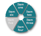

Here are the same items arranged in a linear menu:
Item two
Item three
Item four
Item five
Item six
Pie menus can be used in web apps, like for example in the famous Songza or in webmail applications, where you can click on an email in your inbox to get a menu with possible actions (e.g. open, reply, mark as spam, delete). Commands that you would put in a traditional context menu.
The advantage of pie menus over traditional linear menus is that all its items are very easy to target with the mouse cursor. That's mainly because of two reasons:
- We are much better in moving the mouse in a particular direction that in moving it a particular distance.
- Items closer to the mouse cursor are easier to hit.
Try it! Click anywhere into this text paragraph to activate the menu and select an option. Now try the following: Before invoking the menu, think of the sector you want to click (e.g. top, lower right, etc.). Then quickly invoke the menu and click this sector immediately. You will find that you can hit any sector very quickly, almost without looking and with surprising precision. Soon there won't be any hesitation between summoning the menu and selecting an option. It becomes one single gesture.
Part of this effect is explained by Fitts's Law: The time one needs to click on a target is a function of the target's size and its distance. Therefore, no two items in a traditional linear menu are equally easy to click. That's why item order is critical in linear menus. It is much less of an issue for pie menus.
Another effect of pie menus is that their use becomes habitual. That means that after having selected an item a couple of times, we do not need to read its label any more, we even almost don't have to look at it any more. For example, there's an on-screen object, and clicking it invokes a pie menu where the south item means "mark as read". To mark that item as read, you click it, move the mouse a bit to the south, and click again. Soon you will become very quick at performing these steps, and you will stop paying attention to the menu selection as you make it. Your muscle memory will do it for you. The invocation of the pie menu and the selection of the item have been fused into one single, habituated, gesture. Habituation is also the reason why it is so important for the same menu to always have the same item ordering. This rule applies to linear menus, too. Nothing is more frustrating than clicking on an spot you've clicked a hundred times before, only realizing a split-second later that this time, the item didn't read "duplicate" but "delete".
Pie menus were first devised by Don Hopkins et al. back in the 80s. On his site, you will also find much original research on pie menus.
Behavior and layout of pie menus
Pie menus are invoked in just the same way you would invoke an ordinary menu. For example by left- or right-clicking an item on the screen. In fact, context menus are a perfect use for a pie menu layout. It is crucial that the pie menu centers exactly around the current mouse cursor position, or it would become less efficient to use, even less so than a traditional linear menu.
If we want to make our menu keyboard-invokeable, we should also make it keyboard-controllable, e.g. with the cursor keys (up key selects north item, down left keys select southwest item, etc.). Invocation by keyboard doesn't make sense for solely mouse-operated pie menus. Because the user has to take hold of the mouse, they can't habituate the menu. In this example, we'll focus on solely mouse-operated pie menus.
Pie menus are dismissed without making a selection when the user clicks in their middle, or outside of them (same as with traditional menus), or by moving the mouse more than a certain distance away from the menu. This diminishes the risk of accidentally dismissing the menu when overshooting. I suggest this buffer distance be about equal to the menu's diameter.
In the middle of the menu, there will be a circular area, acting as a dead zone. Nothing gets selected when the user clicks in this area. Its purpose is to easily dismiss the menu and to prevent accidental selection of the wrong item. This zone should be larger if the users are not proficient mouse users, if the use situation may be stressful, or if the users may be in a hurry. But at the same time, we shouldn't make the dead zone too large, or we are wasting the advantage of having the menu items near the mouse cursor.
The respective click-areas (hotspots) of the items are sector- or wedge-shaped (with a bit at their inner tip missing because of the dead zone). They form a ring around the mouse cursor. The wider we make this ring, the easier it is to hit an item. Even if the respective items present themselves like rectangular icons or other shapes, the underlying hotspots should always be sectors or wedges, or we lose many advantages of pie menus.
Menu appearance
Like a normal context menu or pull-down menu, a pie menu should look like it temporarily floats over the original screen content. This is even more critical as most users are still unfamiliar with pie menus and otherwise might think it only was some odd circular image that for some reason has replaced the clicked-on object. So, in a way, floating suggests menu-ness. We can support this by animating the menu consistently when opening and dismissing it, to clearly show where it comes from. We elevate it from the page with a drop-shadow and we can further suggest its temporary nature by making it partially translucent.
Item appearance
We best make the presentation show how to use the menu, particularly as we want to quickly get across the idea of how to use it. As the hotspots are sector-shaped, we also should make the items sector-shaped. This is sometimes more difficult to achieve technically than working with ordinary rectangular icons, but worth the trouble. Additionally, the sectors should best have little gaps between them. This tells the user that the items are individually selectable entities. This is particularly important if you give them pseudo-physical behavior, similar to buttons. If you want the sectors perceived as being "touchable", they should look loose and "moveable", and not like if they were fused to each other. In the real world, you've probably already come across buttons that didn't look like buttons at all. On some microwaves, and on heavy machinery, buttons sometimes only appear as rounded rectangles drawn on smooth surfaces. That's because they have to be easy to clean. But avoid this on the Web. Good UI elements suggest (or afford) how to use them.
Some pie menus use text, some use icons. As a personal side note, I'm strongly biased towards text, because you can't just "read" icons you've never seen before. That is, most unfamiliar icons have to be explained before they can be used. And, ironically, that explanation is given in the form of written text (e.g. in a tooltip). Often, it's better to just use text in the first place. It saves one step of interpretation and does not burden the user with an additional symbol to memorize.
Inactive, highlighted and selected states
Inactive menu items should not be removed from the menu, but rendered inactive (e.g. "grayed out"), to support the users' habit-building ability.
Most users will not be familiar with pie menus. That's a serious problem. In order to suggest that the sectors can be clicked on, in addition to the sector's look we are using a mouseover highlighting effect that shifts and enlarges the sector slightly when the user moves their mouse cursor over that sector.
When the user clicks on a sector, it's a good idea to make the selected sector appear "pushed down", similar to a button. That completes the pseudo-physical behavior of the menu. [I'm skipping this step to keep the example lean and mean.]
Item arrangement
Fortunately, unlike with linear menus, we can't really make bad ordering mistakes here, as all items are about equally easy to target. The items straight north, south, west and east are a little easier to hit than the diagonal ones, but that's about all. When arranging them, we should keep in mind that most often, the items have a meaningful relationship to each other. Here is in fact another advantage of pie menus that linear menus don't have: Thanks to the spatial arrangement, we can provide the user with natural mappings as additional cues. For example, we could position a "go back" item to the west, a "go forward" item to the east, a "download" item down south, and so on.
Where on the web can pie menus be used?
[This section is still fairly incomplete]
Applications for pie menus are rare, but rewarding. One shouldn't be tempted to replace ordinary links or navigation with pie menus. They still have one very basic shortcoming in common with regular pop-up menus: Lack of visibility.
Pie menus mustn't be used where they cannot be placed around the mouse cursor.
Don't use pie menus if the set of menu items presented can change. This forfeits habituation. If menu items can change, use an always-open, non-pop-up, linear menu (while selection in pie menus beats linear selection by lengths, finding a new item is far easier in a linear list or menu than in a pie menu).
Don't use pie menus near the border where a part of the menu may be cut off. Shifting the menu inwards to be fully visible is not a solution, because the habituated ("blind") gesture will now miss the desired item and maybe even select a wrong one (The mouse pointer would not be centered in the pie menu). Moving the mouse pointer accordingly (if at all possible) is not a solution, because it disorients and thus slows down the user (and most likely even distracts the user from the task they wanted to achieve).
Possible applications are not on ordinary not-particularly-interactive web sites, but rather on mini applications like the famous Songza or a web mail application. (As a side note, I find Songza's interface very well thought-out, but the way the pie menu works doesn't quite agree with me in detail, particularly the sub-menus to the left and to the right, that they're are relatively hard to hit and interfere with dismissing the menu.)
A comprehensible implementation of pie menus
What we need:
- some images
- HTML
- JavaScript
Some assembly required.
Although there are several different approaches for rendering shapes in the browser, I found it easiest to use images for the pie menu. Some other relevant techniques are SVG, building the image out of tiny DIV elements or generating bitmaps using JavaScript. And, of course, there are also approaches using Flash and server side techniques. But all of those quickly become unwieldy, and I wanted my example to be as clear as possible.
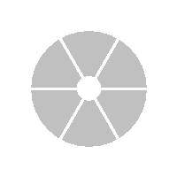
So, say we want a pie menu with six sectors. In fact, I should have made it eight sectors, because with six, I'm wasting the straight west and east directions. Anyway, we first need an image of the inactive menu. This is a GIF with a transparent background. Note that I left some room on each side. This is because I made all images to have the same dimensions, so there will be no hassle when positioning the individual elements later.
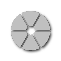
Out of that image, we can build a drop shadow using our favorite graphics manipulation software. This is a PNG image with an alpha channel. In Internet Explorer 6, its background will appear opaque (not transparent). There is a way to make IE6 display PNG alpha channels, but I'll leave this out for now to keep things simple.
Now we make a copy of our first "inactive" GIF image, change its color, and make six images for each of the sectors. The background, again, is transparent.
 ,
,  , ...
, ...
Next we make six images for the mouseover highlighting effect, with transparent background. (If you want to keep the number of images low, you could also use a technique to put all pie sectors in one single image.)
 ,
,  , ...
, ...
And last but not least, we make another GIF that's completely transparent and thus invisible. I made this one the same size too. It will accommodate a clickmap of the sectors.
![]() (invisible image)
(invisible image)
Stacking the elements
This is the stacking order of the menu's elements, from back to front:
- Drop shadow
- Inactive menu (I didn't combine this with the shadow image because of IE6's problems with PNGs with alpha channel)
- Sectors one to six (for inactive sectors just hide their corresponding image here)
- Active sectors one to six (all hidden)
- An unordered list containing the sectors' labels or icons (I prefer textual labels)
- Transparent covering image (with clickmap)
The resulting HTML looks like this:
<div id="radialMenu">

<div id="radialViewContainer">

<img src="./radialmenu/shadow.png">
<img src="./radialmenu/disabled.gif">

<img src="./radialmenu/available-1.gif">
<img src="./radialmenu/available-2.gif">
<img src="./radialmenu/available-3.gif">
<img src="./radialmenu/available-4.gif">
<img src="./radialmenu/available-5.gif">
<img src="./radialmenu/available-6.gif">

<img id="radialActive1" class="active" src="./radialmenu/active-1.gif">
<img id="radialActive2" class="active" src="./radialmenu/active-2.gif">
<img id="radialActive3" class="active" src="./radialmenu/active-3.gif">
<img id="radialActive4" class="active" src="./radialmenu/active-4.gif">
<img id="radialActive5" class="active" src="./radialmenu/active-5.gif">
<img id="radialActive6" class="active" src="./radialmenu/active-6.gif">

<ul>
	<li id="radialText1">Item<br/>one</li>
	<li id="radialText2">Item<br/>  two</li>
	<li id="radialText3">Item<br/>three</li>
	<li id="radialText4">Item<br/>four</li>
	<li id="radialText5">Item<br/>five</li>
	<li id="radialText6">Item<br/>six</li>
</ul>
</div> <!--end: id="radialViewContainer"-->

    <img usemap="#radialMenuMap" src="./radialmenu/transparent.gif">

    <map name="radialMenuMap">
        <area shape="poly" coords="93,88,62,32,99,18,137,33,107,88" href="javascript:radialClick(1)" alt="" onmouseover="highlight(1)" onmouseout="unhighlight(1)" />
        <area shape="poly" coords="107,88,137,33,171,62,176,100,113,100" href="javascript:radialClick(2)" alt="" onmouseover="highlight(2)" onmouseout="unhighlight(2)"/>
        <area shape="poly" coords="113,100,176,100,167,140,138,166,107,111" href="javascript:radialClick(3)" alt="" onmouseover="highlight(3)" onmouseout="unhighlight(3)"/>
        <area shape="poly" coords="107,111,138,166,100,177,63,166,94,111" href="javascript:radialClick(4)" alt="" onmouseover="highlight(4)" onmouseout="unhighlight(4)"/>
        <area shape="poly" coords="94,111,63,166,31,140,24,100,86,100" href="javascript:radialClick(5)" alt="" onmouseover="highlight(5)" onmouseout="unhighlight(5)"/>
        <area shape="poly" coords="86,100,24,100,30,60,62,32,93,88" href="javascript:radialClick(6)" alt="" onmouseover="highlight(6)" onmouseout="unhighlight(6)"/>
    </map>
</div> <!--end: id="radialMenu" -->
Of course, I shouldn't really have used HTML event attributes and that many IDs: One should rather write some unobtrusive JavaScript that gathers all the information from the UL element, generates the necessary menu elements dynamically and calculates the hotspot coordinates itself. Or, instead of using hotspot coordinates, the JavaScript could also just use the angle of the current mouse position relative to the pie menu's center. But I like to present the HTML markup like I do because I think that its inner workings become more apparent that way.
This is the CSS:
#radialMenu
{
	position:absolute;
	width:200px;
	height:200px;
	opacity:0.9;
}
#radialMenu #radialViewContainer
{
	position:absolute;
	top:0px;
	left:0px;
	width:200px;
	height:200px;
}
#radialMenu img
{
	border:none;
	position:absolute;
	top:0px;
	left:0px;
	width:100%;
	height:100%;
}
#radialMenu img.active
{
	visibility:hidden;
}
#radialMenu ul
{
	margin:0;
	padding:0;
	position:absolute;
	top:0px;
	left:0px;
	list-style-type:none;
	color:#EEEEEE;
	font-size:8pt;
}
#radialMenu li
{
	position:absolute;
	text-align:center;
	white-space:nowrap;
}
#radialMenu li.active
{
	color:#FFFFFF;
}
#radialMenu #radialText1
{
	top:39px;
	left:82px;
}
#radialMenu #radialText2
{
	top:70px;
	left:120px;
}
/* ... */
#radialMenu .active#radialText1
{
	top:36px; /* slightly shifted outwards */
}
#radialMenu .active#radialText2
{
	top:69px; /* slightly shifted outwards */
	left:122px;
}
/* ... */
I did not include the resizing steps from the animation in here. There's not much to the animation. Every image has its width and height given as 100% of its container, so I simply change their container's size to scale them.
Here is some JavaScript that controls the menu's behavior. (Sans animation. You can see the full code when you view this page's source).
function showRadial(evt)
{
	var p = mousePos(evt);
	var rm = document.getElementById("radialMenu");
	rm.style.left=(p.x-100)+"px";
	rm.style.top=(p.y-100)+"px";
	rm.centerCoords = p;
	rm.style.display="block";
	addEvent(document, "mouseup", hideRadial);
	addEvent(document, "mousemove", checkMouseToRadialDistance);
	cancelEvent(evt);
}
function hideRadial()
{
	document.getElementById("radialMenu").style.display="none";
	removeEvent(document, "mouseup", hideRadial);
	removeEvent(document, "mousemove", checkMouseToRadialDistance);
}
function highlight(nr)
{
	var ra = document.getElementById('radialActive'+nr);
	var rt = document.getElementById('radialText'+nr);
	if (!ra || !rt) return;
	ra.style.visibility="visible";
	rt.className="active";
}
function unhighlight(nr)
{
	var ra = document.getElementById('radialActive'+nr);
	var rt = document.getElementById('radialText'+nr);
	if (!ra || !rt) return;
	ra.style.visibility="hidden";
	rt.className="";
}
function radialClick(sectorNumber)
{
	showOverlayMessage(sectorNumber);
}
function checkMouseToRadialDistance(evt)
{
	var rm = document.getElementById("radialMenu");
	var pos = mousePos(evt);
	if (distance(pos.x,pos.y,rm.centerCoords.x,rm.centerCoords.y) > 200)
	{
		hideRadial();
	}
}
// Some functions left out for brevity. Most of them can be found on the web:
// - distance calculates the distance between two points
// - addEvent adds an event handler
// - removeEvent removes an event handler
// - mousePos gets the current mouse position
// - showOverlayMessage shows a transparent message
And this is the result:
[Click here to activate the pie menu]
I hope that you enjoyed reading this article as much as I enjoyed writing it. If you've got comments or are interested in more details, just use the contact form to get in touch with me.


- Item
one - Item
two - Item
three - Item
four - Item
five - Item
six
OpenOffice.org: Modeless Page Arrangements
November 2007
I participated in an interesting mailing list discussion about introducing a new page view mode for the users who want to view two pages next to each other while editing. To be frank, I'm not a big fan of modal user interfaces. I am deeply convinced that there must be a solution that satisfies most users while at the same time reducing the number of modes.
I made some OpenOffice Interface Demos that you can try out in your web browser. The only functional elements are the scroll area and some controls at the bottom of the window. My personal favorite is Demo number 2, and if it didn't have that "facing pages" checkbox, there wouldn't be any view modes whatsoever!

{if(e.stopPropagation)e.stopPropagation;if(e.preventDefault)e.preventDefault;e.cancelBubble=true;e.cancel=true;e.returnValue=false};document.onmousedown=function(e){e=e||window.event;resizeObject=e.srcElement||e.target;mouseOffset=e.clientX;resizeObjectOriginalWidth=resizeObject.offsetWidth;cancelEvt(e)};document.onmousemove=function(e){e=e||window.event;if(resizeObject){resizeObject.style.width=(resizeObjectOriginalWidth+e.clientX-mouseOffset)+'px%20!important'};cancelEvt(e)};document.onmouseup=function(e){e=e||window.event;%20resizeObject.style.background='';resizeObject=null;mouseOffset=null;cancelEvt(e);document.onmousedown=document.onmousedownBackup;document.onmousemove=document.onmousemoveBackup;document.onclick=document.onclickBackup;document.onmouseup=document.onmouseupBackup;document.onmouseover=document.onmouseoverBackup;document.onmouseout=document.onmouseoutBackup};document.onclick=function(e){e=e||window.event;cancelEvt(e)};document.onmouseover=function(e){if(resizeObject)return;e=e||window.event;e=%20e.srcElement||e.target;e.style.background='#F0F0F0%20url(http://schuderer.net/pic/horizontalgrip.gif)%20repeat-y%20top%20right'};document.onmouseout=function(e){if(resizeObject)return;e=e||window.event;e=%20e.srcElement||e.target;e.style.background=''};void(0);)